The Tiny Home Decor Color Wheel: A Beginner’s Friend
Picking paint for small walls feels harder than it should. Many folks stand in a hardware store, staring at a giant paint chip display, completely lost. A little living room needs a color that opens up the space, not one that shrinks it down with dark shadows. Good news: an actual tiny home decor color wheel shows you how to choose hues that make square footage feel much larger. A simple color wheel chart breaks down the confusing world of shades into easy steps. You learn how pale blue walls reflect natural light across a compact kitchen. Discover how warm cream furniture or cool gray textiles create visual flow from one area to the next. The tool helps you build a cohesive look, making a small home feel inviting and expansive. Let’s walk through it.
1. Monochromatic Comfort Zone
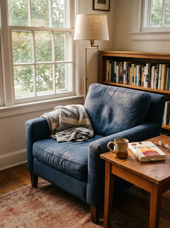
A deep blue armchair creates a calm, inviting spot in the cozy room. Homeowners can build a peaceful space by choosing different shades of one main color for furniture and accessories. Avoid mixing too many bright, clashing colors.
2. Analogous Harmony Nook
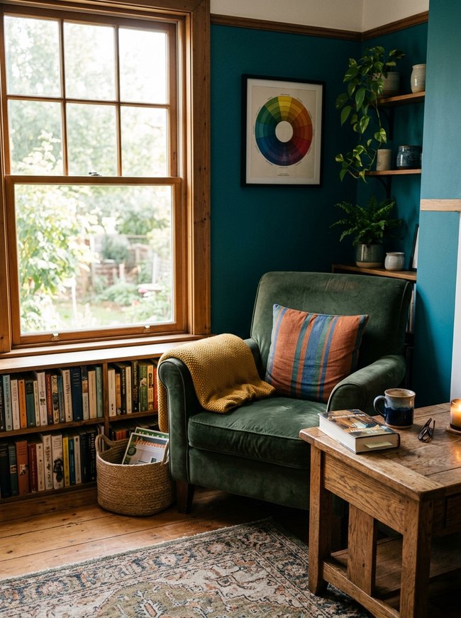
A dark teal wall provides a bold backdrop for a mossy green velvet armchair. The small space feels warm and inviting with rich colors. A color wheel helps pick shades next to each other, like these blues and greens, for a cozy feel. Choose two or three colors that sit side by side on the color wheel for a harmonious room.
3. Complementary Pop Corner
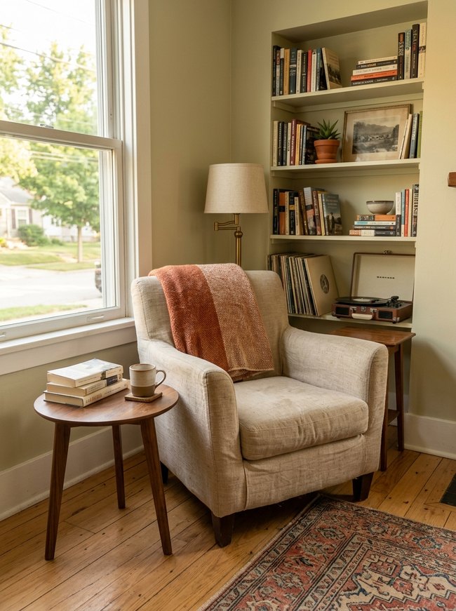
Soft green walls create a calm backdrop for richer, warm tones. A striped orange and cream blanket draped over the neutral armchair adds a bright, cozy splash of color. When picking colors for a tiny home, choose one bold accent to make a corner pop.
4. Triadic Zest Workspace
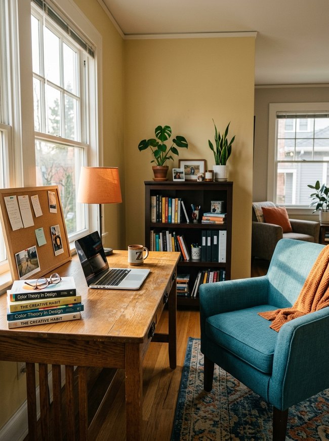
A vibrant teal armchair with a soft orange throw blanket draws the eye into the sunny workspace. A triadic color scheme with warm yellow walls, a cool teal chair, and a bright orange accent creates a lively, balanced feeling. Designers choose one main color for larger items like walls or furniture, then add smaller touches of the other two colors.
5. Split Complementary Serenity
A soft teal armchair sits next to a tall wooden bookshelf filled with books and green plants. Designers use a split complementary color scheme by picking one main color, like the blue-green chair, then adding two colors next to its opposite on the color wheel, such as the warm orange throw blanket and the yellow-green plant leaves. Avoid using equal amounts of all three colors; let one color dominate the room.
6. Tetradic Bold Living
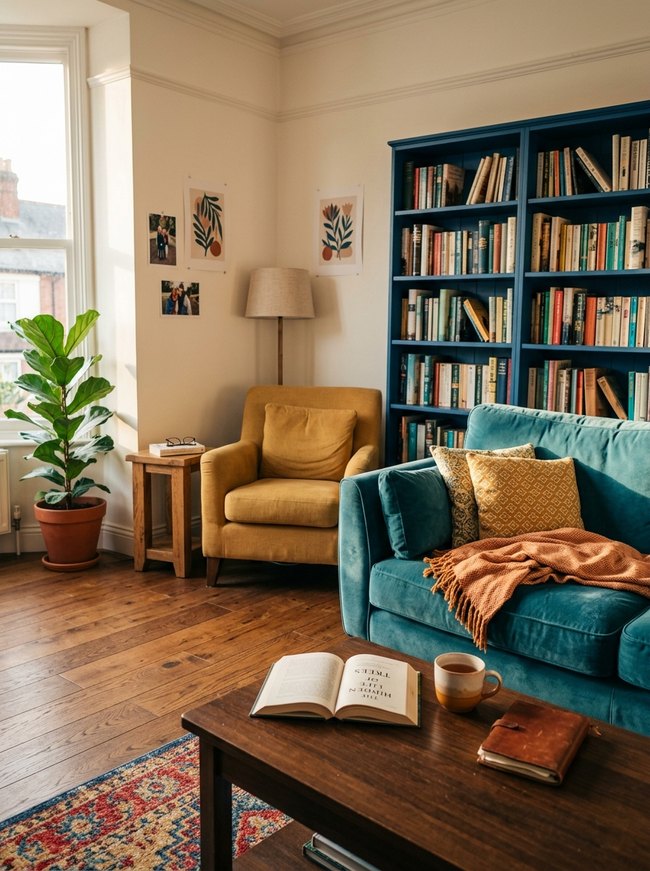
The deep teal velvet sofa and bright mustard yellow armchair create a lively color contrast. Homeowners can use this bold color combination in their own tiny home decor by choosing two main colors that sit opposite each other on the color wheel. A warm terracotta throw blanket on the sofa adds another bright accent.
7. Warm Hue Embrace
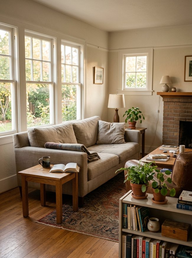
Many windows flood the room with natural light, softening the cream wall paint and making the space feel open. Terracotta pots and a brick fireplace add warm color to the tiny home’s decor. Rich textures and natural wood tones create a welcoming, lived-in atmosphere.
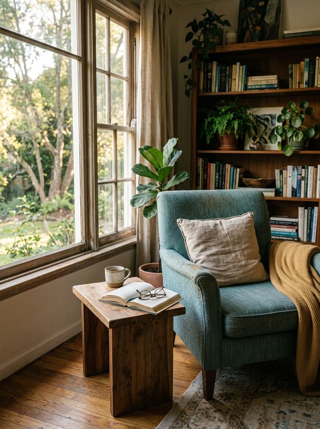
8. Cool Tone Retreat
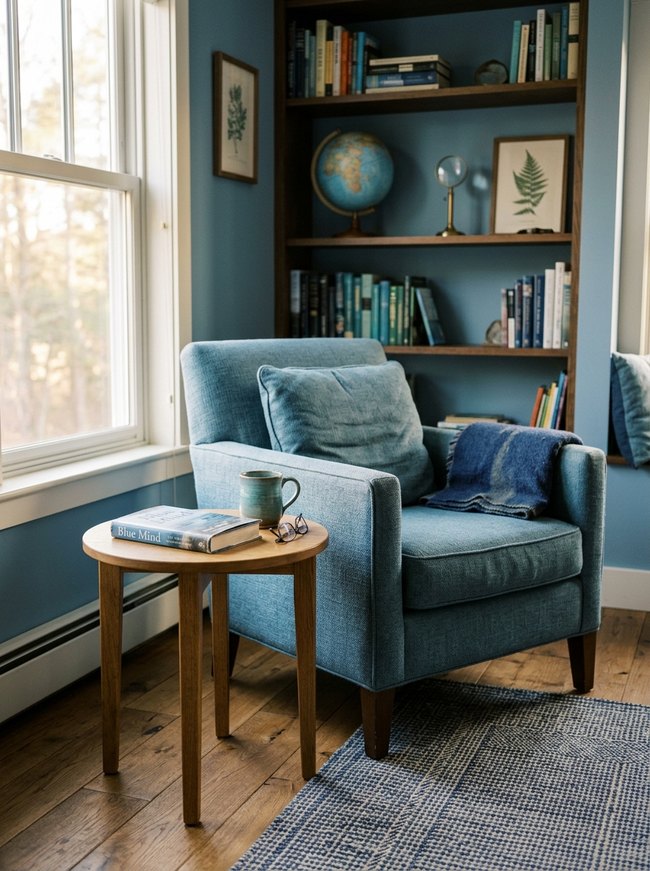
The muted teal armchair brings calm to the cozy corner, inviting you to relax. Teal wall paint behind the chair blends with warm wood shelves, creating a soft background for varied blue book spines and a light blue globe. Cool tones make a small room feel larger and more peaceful.
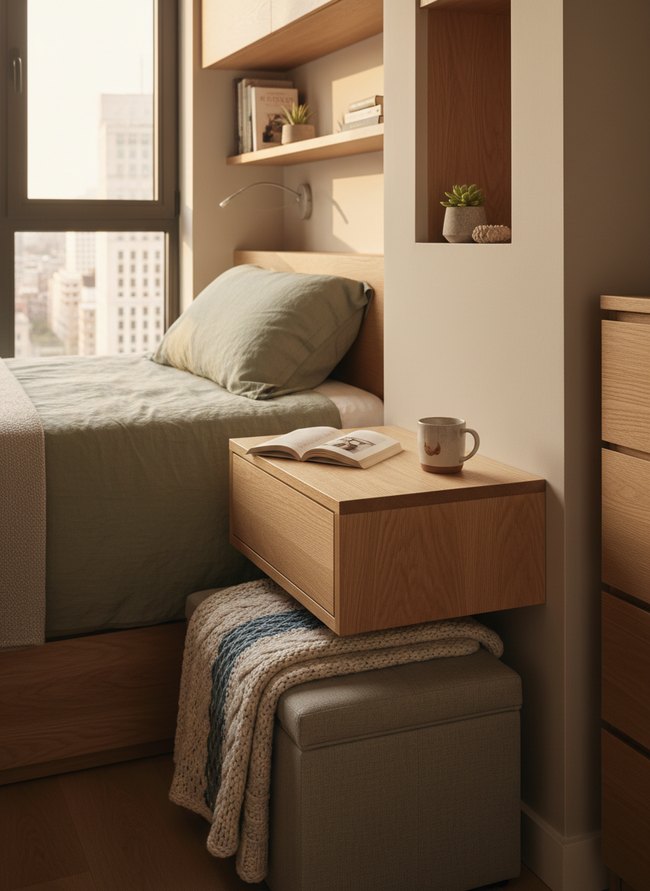
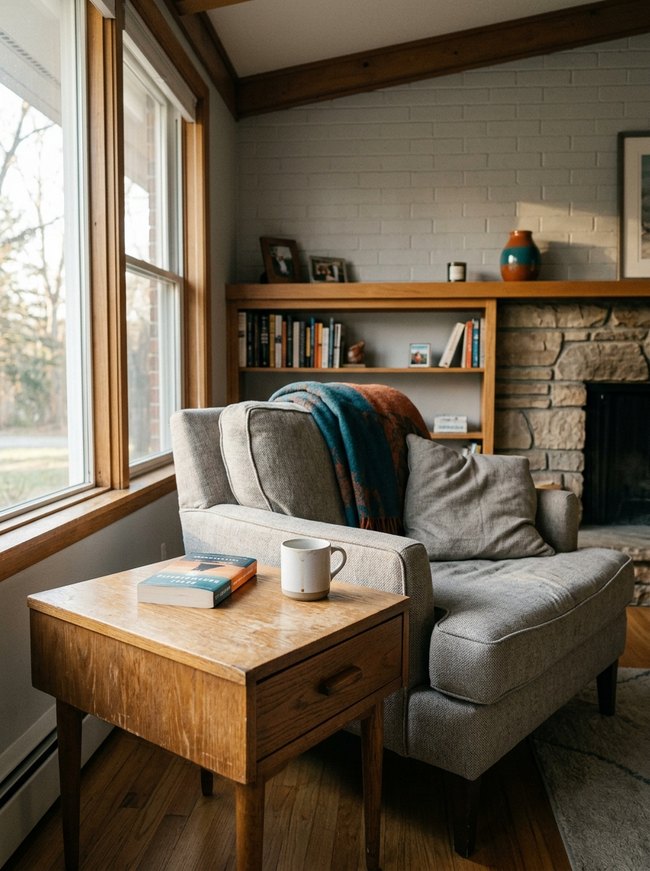
9. Neutral Base Palette
Warm beige walls offer a soft background for varied wooden furniture and natural green plants. Painting main living spaces a light neutral color makes the room feel open and bright. Light wood tones for floors and bookshelves keep the space feeling airy.
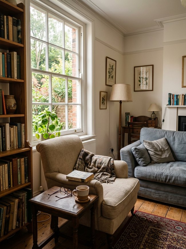
10. Accent Color Splash
A vibrant teal and rust plaid blanket draped over a beige armchair adds a cozy feel to the room. Small splashes of bold color introduce soft items like throw blankets and decorative pillows. One or two bright accent colors avoid overwhelming a small space.
11. Pastel Whispers Bedroom
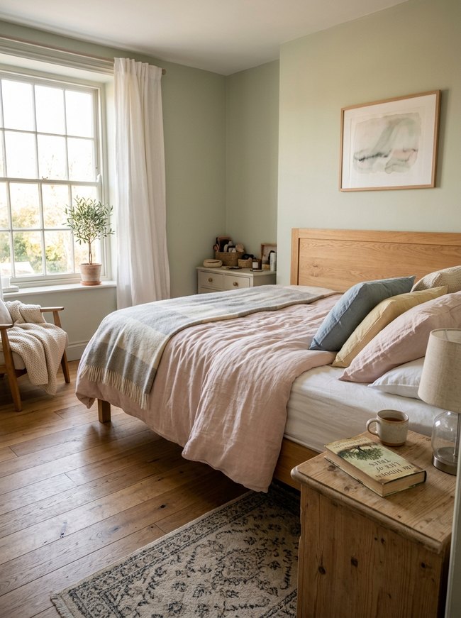
Soft green wall paint creates a calm, airy feeling in the bedroom. Pastel shades like dusty pink and light blue on the bedding keep the space feeling open and bright, a smart choice for a tiny home. Consider painting walls a muted color and adding lighter bedding to achieve a similar peaceful look.
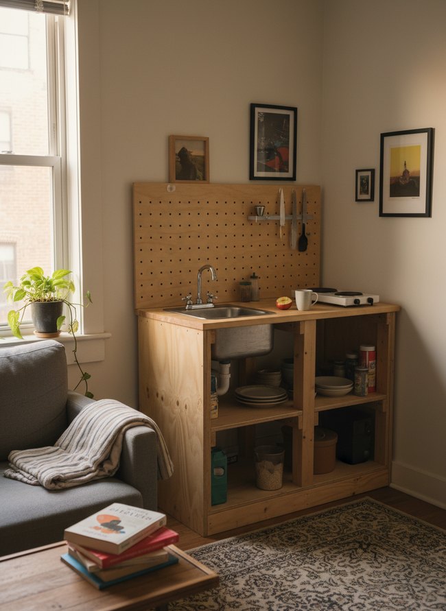
12. Earthy Tones Kitchenette
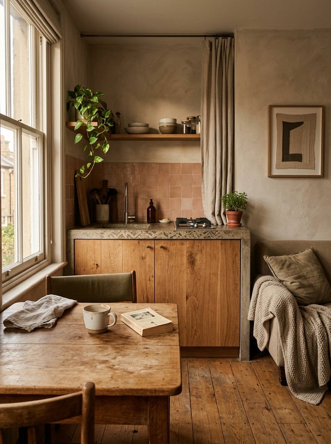
Small square terracotta backsplash tiles bring warmth and a pop of muted color to the tiny kitchenette. Earthy tones like dusty rose and warm beige create a cozy, inviting space. Avoid bright, stark whites when designing with calming colors.
My Tiny Home Feels Like a Clown Car: Avoiding Color Overload in Small Spaces
Most people assume tiny homes need white walls. Pale colors supposedly expand cramped rooms. Your small space can handle bold tones. A charcoal accent wall actually pulls the far wall closer, creating a cozy den effect. Many folks believe every surface needs a different shade. This approach makes a room feel chopped up, like a patchwork quilt. Instead, choose one main wall color, perhaps a dusty teal, and repeat that color in three different textures across the room. A woven throw blanket on the sofa, a glazed ceramic vase on the oak windowsill, and a painted wooden chair all carry the same hue. This trick creates flow, guiding your eye around the entire area. You might think a bright red sofa is too much for your small living room. Actually, a single large, vibrant piece grounds the space, drawing attention and giving the eye a place to rest. Smaller, busy patterns, however, can truly make your tiny home feel like a cluttered clown car. A solid, rich color on that single velvet sofa works much better. Avoid too many small, colorful items scattered everywhere. Gather your colorful treasures onto one three-tier shelf against a neutral background. This move organizes the visual noise, making your compact dwelling feel calm and collected.
The ‘Perfect’ Paint Chip Looks Ghastly on My Wall: Understanding Light & Space
Most homeowners think a paint chip shows a color’s true face. You likely grab the small, glossy square, picturing that deep forest green on your accent wall. However, actual light changes everything. Natural sunlight streaming through a west-facing window bathes a charcoal wall with warm yellow tones. A small sample card cannot capture this dynamic shift.
Artificial light sources also twist shades. Your warm, amber Edison bulb casts a honeyed glow on a dusty teal surface. Fluorescent office lights, by contrast, make a similar blue-green look much colder. People often pick a color based on its look under bright store lights, then feel surprised by the flat result at home.
Clever decorators paint large, double-wide swatches directly onto their actual walls. Observe these generous painted rectangles throughout the day. Watch the subtle shifts as the morning sun casts its pale rays across the south-facing wall. Notice how your overhead pendant light changes the color’s depth after dusk. A specific wall will interact uniquely with its direct lighting.
Consider your tiny home’s compact dimensions. A pale cream hue might expand a narrow galley kitchen under soft task lighting. Darker colors, while cozy, can make a low ceiling feel even lower. A single color never behaves the same in two different rooms. Always test your chosen pigment in the specific space where it will live.
Which Idea Will You Try First?
That’s 12 different takes on tiny home decor color wheel. The best ideas above are usually the smallest moves — one material, one layout shift, one piece of furniture in the right place. Pick whichever room feels closest to your space and start there before tackling the rest.
Found an idea worth keeping? Save this post to your Pinterest board so it’s waiting for you when you’re ready to start your own project.